
Module showcase
Every Act3 module on one page, each in several variants. Each block is labelled with the module and the settings you pick in the editor — a quick way to see what is possible beyond the demo.
Hero slider
3 slides: photo + overlay left, solid accent colour centred, light colour scheme right. Settings: height natural/full, animation fade/loop, arrows/dots per breakpoint.
Hero slider — left aligned
Background photo with dark overlay, text on the left (horizontal_align: items-start, text_align: left).
Light colour scheme, right
color_scheme: light on a light photo with white overlay, text on the right.
Typography
The three text modules and their main style options. Background of this section: section-extra-settings bg_color light.
section-intro · default
Default title
title_tag h2, divider auto, text_size normal.
section-intro · display + accent divider
Display title
title_looks_like display, divider accent, text_size large.
section-intro · compact h4, centred
Compact title
title_looks_like h4, text_size small, wrapper text_align center.
heading · display / h1 / h2 / h3 / h4
Display heading
Heading 1
Heading 2
Heading 3
Heading 4
rich-text · lists, quote, divider
Rich text
Paragraph with a link, bold and italic. All styles come from the theme settings.
- Bullet one
- Bullet two
- Numbered one
- Numbered two
A blockquote in the rich-text module.
Buttons
Combinations of color × fill × size × shape. Also available: type cta (HubSpot CTA) and custom-gradient / custom-color.
Buttons on dark
This section: bg_color dark + top_deco angle. The top/bottom_deco can also be waves, concave or convex.
on dark · white / white-accent / ghost
on dark · outline white, pill
Icons
shape disc/square/none × fill/outline × size small–extra-large; type icon, image, number or custom SVG code.
disc · fill · large
square · outline · large
none · extra-large
disc · fill · small
Feature cards
Per card: color, shadow, text_align, icon (icon/image/number/code) with its own shape/fill/size. Columns s12/s6/s4/s3.
card.color white / accent / dark · icon disc fill · s4
white / light · left aligned · square outline · number icon · s3
Step one
Cards make features easy to scan and click.
Step two
Cards make features easy to scan and click.
Step three
Cards make features easy to scan and click.
Step four
Cards make features easy to scan and click.
Content cards
Card with image, icon or number. Options: collapse_desc, sync_desc (equal height), columns s12/s6/s4, color_scheme light/dark.
with image · s4 · light
Card with image
Far far away, behind the word mountains, far from the countries Vokalia and Consonantia.

Card with image
Far far away, behind the word mountains, far from the countries Vokalia and Consonantia.

Card with image
Far far away, behind the word mountains, far from the countries Vokalia and Consonantia.

Content cards on dark
Same module, color_scheme dark, with icon and number variants.
no image · icon · s4 · color_scheme dark · collapse_desc
Icon card
Far far away, behind the word mountains, far from the countries Vokalia and Consonantia.

Icon card
Far far away, behind the word mountains, far from the countries Vokalia and Consonantia.

Icon card
Far far away, behind the word mountains, far from the countries Vokalia and Consonantia.

number · s6 · sync_desc
Number card
Far far away, behind the word mountains, far from the countries Vokalia and Consonantia.
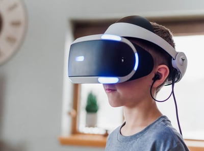
Number card
Far far away, behind the word mountains, far from the countries Vokalia and Consonantia.
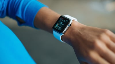
Cover cards
Image as background with overlay; content_align 1–7 positions the text. Column layouts 1/2/3/4 and asymmetric 2l/2r.
col 3 · content_align 7 (bottom) / 4 (middle) / 1 (top) · dark & light
No image, light
No image, color_scheme light.
col 2l · narrow card left, wide right
Wide card
Layout 2l: narrow left, wide right (2r is the reverse).
Navigation cards
Clickable cards with an arrow. Both also available as slider (arrows/dots per breakpoint, center_mode).
go-card · col 4 · color white / accent / dark / light
go-card · slider · center_mode
compact-card · col 3 · white / accent / dark, centred
Box over image
Text box overlapping an image: align left/right/top-left/top-right/bottom-left/bottom-right, color accent/dark/light/white.
align top-left · color accent
Powerful Design
Far far away, behind the word mountains, far from the countries Vokalia and Consonantia.
align bottom-right · color dark
Powerful Design
Far far away, behind the word mountains, far from the countries Vokalia and Consonantia.
default · align right · color white
Powerful Design
Far far away, behind the word mountains, far from the countries Vokalia and Consonantia, there live the blind texts.
Image box
Image with caption: show always/on-hover/never, overlay colour and opacity, extra spacing. Also available as slider.
col 4 · caption always / on-hover / accent overlay / light overlay + space
Team cards
Photo, name, role and social icons. Columns 1–5, card colour per person, also available as slider.
col 4 · color white / light / accent / dark
Image + text
The classic 50/50: order, stacking on mobile, radius/shadow and buttons.
order it · image left, text right
Image left, text right
settings.order: it. On mobile, stack_order decides whether the image goes above or below.
order ti · text left, image right · img_shadow · no radius
Text left, image right
settings.order: ti, img_radius off, img_shadow on, outline button.
On a photo background
section-extra-settings: bg_media image + overlay dark 80% + top_deco waves / bottom_deco waves-reverse.
On a photo background
color_scheme dark. This section uses a background photo with an 80% dark overlay and wave decorations at the top and bottom.
Quick features
Icon + title + short text in a grid. Columns s12/s6/s4, icon disc/square/none, desc_size, stacking on mobile.
s4 · disc fill large
CRM Platform
Software as a Service
Enterprise Level
Behind the Words
Brand Identity
Dummy Content
Quick features on dark
Same module, different icon shape and columns.
s6 · square outline · color_scheme dark · desc_size normal
CRM Platform
Software as a Service
Enterprise Level
Behind the Words
Numbers
Large number + text. color_scheme light, dark or dark-no-accent.
color_scheme light
Traffic Increase
Far far away, behind the word mountains.
Leads Generated
Far far away, behind the word mountains.
Average Rating
Far far away, behind the word mountains.
Countries
Far far away, behind the word mountains.
Numbers on accent colour
section-extra-settings bg_color accent + numbers dark-no-accent.
on accent background · dark-no-accent
Traffic Increase
Far far away, behind the word mountains.
Leads Generated
Far far away, behind the word mountains.
Average Rating
Far far away, behind the word mountains.
Countries
Far far away, behind the word mountains.
Steps
Process in steps with connecting line and tooltip; icon, number or custom SVG. color_scheme light/dark/dark-no-accent.
icon type icon (default)
Lorem ipsum dolor sit amet, consectetur adipiscing elit. Nunc ultrices auctor dui non accumsan.
icon type number · 4 steps
Step 1
Lorem ipsum dolor sit amet, consectetur adipiscing elit.
Step 2
Lorem ipsum dolor sit amet, consectetur adipiscing elit.
Step 3
Lorem ipsum dolor sit amet, consectetur adipiscing elit.
Step 4
Lorem ipsum dolor sit amet, consectetur adipiscing elit.
Timeline
Milestones with date, text and image, alternating left/right. valign top/center.
We started our business in a garage
Lorem ipsum dolor sit amet, consectetuer adipiscing elit. Aenean commodo ligula eget dolor.
We launched our first product
Lorem ipsum dolor sit amet, consectetuer adipiscing elit. Aenean commodo ligula eget dolor.
We acquired this amazing company
Lorem ipsum dolor sit amet, consectetuer adipiscing elit. Aenean commodo ligula eget dolor.
Eric joined our team
Lorem ipsum dolor sit amet, consectetuer adipiscing elit. Aenean commodo ligula eget dolor.
Tabs
Tab buttons with their own colour/fill for active and inactive, alignment and size.
default · pill · accent active
Far far away, behind the word mountains, far from the countries Vokalia and Consonantia, there live the blind texts. Separated they live in Bookmarksgrove right at the coast of the Semantics, a large language ocean. A small river named Duden flows by their place and supplies it with the necessary regelialia.

It is a paradisematic country, in which roasted parts of sentences fly into your mouth. Even the all-powerful Pointing has no control about the blind texts it is an almost unorthographic life One day however a small line of blind text by the name of Lorem Ipsum decided to leave for the far World of Grammar.
Far far away, behind the word mountains, far from the countries Vokalia and Consonantia, there live the blind texts. Separated they live in Bookmarksgrove right at the coast of the Semantics, a large language ocean. A small river named Duden flows by their place and supplies it with the necessary regelialia.

It is a paradisematic country, in which roasted parts of sentences fly into your mouth. Even the all-powerful Pointing has no control about the blind texts it is an almost unorthographic life One day however a small line of blind text by the name of Lorem Ipsum decided to leave for the far World of Grammar.
Far far away, behind the word mountains, far from the countries Vokalia and Consonantia, there live the blind texts. Separated they live in Bookmarksgrove right at the coast of the Semantics, a large language ocean. A small river named Duden flows by their place and supplies it with the necessary regelialia.
It is a paradisematic country, in which roasted parts of sentences fly into your mouth. Even the all-powerful Pointing has no control about the blind texts it is an almost unorthographic life One day however a small line of blind text by the name of Lorem Ipsum decided to leave for the far World of Grammar.
outline · default shape · centred · dark active
Far far away, behind the word mountains, far from the countries Vokalia and Consonantia, there live the blind texts. Separated they live in Bookmarksgrove right at the coast of the Semantics, a large language ocean. A small river named Duden flows by their place and supplies it with the necessary regelialia.

It is a paradisematic country, in which roasted parts of sentences fly into your mouth. Even the all-powerful Pointing has no control about the blind texts it is an almost unorthographic life One day however a small line of blind text by the name of Lorem Ipsum decided to leave for the far World of Grammar.
Far far away, behind the word mountains, far from the countries Vokalia and Consonantia, there live the blind texts. Separated they live in Bookmarksgrove right at the coast of the Semantics, a large language ocean. A small river named Duden flows by their place and supplies it with the necessary regelialia.
It is a paradisematic country, in which roasted parts of sentences fly into your mouth. Even the all-powerful Pointing has no control about the blind texts it is an almost unorthographic life One day however a small line of blind text by the name of Lorem Ipsum decided to leave for the far World of Grammar.
Far far away, behind the word mountains, far from the countries Vokalia and Consonantia, there live the blind texts. Separated they live in Bookmarksgrove right at the coast of the Semantics, a large language ocean. A small river named Duden flows by their place and supplies it with the necessary regelialia.
It is a paradisematic country, in which roasted parts of sentences fly into your mouth. Even the all-powerful Pointing has no control about the blind texts it is an almost unorthographic life One day however a small line of blind text by the name of Lorem Ipsum decided to leave for the far World of Grammar.
Accordion / FAQ
Collapsible items: default or boxed (border/shadow), first item open, one at a time (toggle).
default · toggle
Lorem ipsum dolor sit amet, consectetuer adipiscing elit. Aenean commodo ligula eget dolor. Aenean massa. Cum sociis natoque penatibus et magnis dis parturient montes, nascetur ridiculus mus. Donec quam felis, ultricies nec, pellentesque eu, pretium quis, sem. Nulla consequat massa quis enim. Donec pede justo, fringilla vel, aliquet nec, vulputate eget, arcu. In enim justo, rhoncus ut, imperdiet a, venenatis vitae, justo. Nullam dictum felis eu pede mollis pretium. Integer tincidunt. Cras dapibus. Vivamus elementum semper nisi.




boxed · shadow · first_expanded
Lorem ipsum dolor sit amet, consectetuer adipiscing elit. Aenean commodo ligula eget dolor. Aenean massa. Cum sociis natoque penatibus et magnis dis parturient montes, nascetur ridiculus mus. Donec quam felis, ultricies nec, pellentesque eu, pretium quis, sem. Nulla consequat massa quis enim. Donec pede justo, fringilla vel, aliquet nec, vulputate eget, arcu. In enim justo, rhoncus ut, imperdiet a, venenatis vitae, justo. Nullam dictum felis eu pede mollis pretium. Integer tincidunt. Cras dapibus. Vivamus elementum semper nisi.
Accordion on dark
color_scheme dark + boxed with border.
Lorem ipsum dolor sit amet, consectetuer adipiscing elit. Aenean commodo ligula eget dolor. Aenean massa. Cum sociis natoque penatibus et magnis dis parturient montes, nascetur ridiculus mus. Donec quam felis, ultricies nec, pellentesque eu, pretium quis, sem. Nulla consequat massa quis enim. Donec pede justo, fringilla vel, aliquet nec, vulputate eget, arcu. In enim justo, rhoncus ut, imperdiet a, venenatis vitae, justo. Nullam dictum felis eu pede mollis pretium. Integer tincidunt. Cras dapibus. Vivamus elementum semper nisi.
Comparison table
Up to 10 columns with yes/no/third icon or text, tooltips, sticky header and dark variant.
default · 3 columns · shadow · clip_corners · center_content
Pricing
Plans with monthly/yearly toggle (subscription) or one-time price, highlighted plan, card colours per plan.
default · 3 plans · middle selected
Pricing on dark
model one-time-fee, color_scheme dark, equal_height.
Reviews
Stars, quote, photo and company logo. Columns 1–4, boxed, quote_size, also available as slider.
col 3 · boxed · rating
Review slider
col 1 + slider + quote_size large on dark.
Quotes
Quote with author card. Size small–xlarge, 1–3 columns or slider.
col 1 · quote_size xlarge
“What a fantastic journey this has been. Thanks to this product we can now focus on what matters.”
Anthony Grower
Marketing Specialist
col 2 · quote_size normal
“What a fantastic journey this has been. Thanks to this product we can now focus on what matters.”
Anthony Grower
Marketing Specialist
“What an amazing team! Like no other in the known universe. Very helpful.”
Sara Inbound
Head of Growth
Logos
Client logos as grid or carousel (autoplay, arrows, dots).
grid · col 6 · no slider (default logos)
Logo carousel
White logos on dark with white arrows.
Features showcase
Feature navigation on the left or right; content changes per item. nav_bg accent/transparent.
col_order left · nav accent
Deploy Without Pain
No installation is needed. HubSpot Marketplace auto-installs the theme for you, so you are ready to adjust settings and create pages right away. Deploy faster than ever before.
Custom Colors and Fonts
Match your brand style with custom colors, fonts, and many other cool settings that will make your website look professional and beautiful. Have the website your brand deserves.
Drag 'n' Drop Editor
Make layout changes, add or remove sections at the page level. Forget about template edits. Customize your styles without leaving HubSpot. No need to edit code.
Performant Website
Get great scores on Google Page Speed Insights, both desktop and mobile. Optimized for content, SEO and accessibility.
Features showcase on dark
col_order right, nav_bg transparent.
Deploy Without Pain
No installation is needed. HubSpot Marketplace auto-installs the theme for you, so you are ready to adjust settings and create pages right away. Deploy faster than ever before.
Custom Colors and Fonts
Match your brand style with custom colors, fonts, and many other cool settings that will make your website look professional and beautiful. Have the website your brand deserves.
Drag 'n' Drop Editor
Make layout changes, add or remove sections at the page level. Forget about template edits. Customize your styles without leaving HubSpot. No need to edit code.
Performant Website
Get great scores on Google Page Speed Insights, both desktop and mobile. Optimized for content, SEO and accessibility.
Shifter
List on the left, changing image/text/form on the right. Order, vertical alignment, auto-scroll and compact nav are configurable.
Created for amazing content & superhero marketers.
Far far away, behind the word mountains, far from the countries Vokalia and Consonantia, there live the blind texts. Separated they live in Bookmarksgrove right at the coast of the Semantics, a large language ocean.
products
services
customers
Blog cards
Recent, popular, or posts selected by tag or author. Card colour white/dark/ghost.
type recent · 3 posts · summary

Sample - How To Post (Clone)
INTRODUCTION: Your “how to” blog post should teach the reader how to do something …

Sample - How To Post
INTRODUCTION: Your “how to” blog post should teach the reader how to do something …
Contact & quick actions
Contact boxes with icon and colour block; quick actions with image + button.
contact-box · s4 · color light / accent / dark
Visit us
25 Growth Street

Inbound City
Call us
+31 20 123 4567
Mon–Fri 9–17
Email us
hello@company.com
Reply within 24 hours
quick-action · s4 · color white / accent / dark
Forms
Pick a HubSpot form in the editor. Options: box none/border/accent/dark/light/white/ghost, colour scheme, button style, hide labels.
form · box white · color_scheme light
Form (light)
form · box dark · color_scheme dark
Form (dark)
Mix & match every variant
Every module above works in any section, on any background. Combine freely — the theme settings control colours and typography.